The right side of the DL Viewer window has the data viewers. There are two types of data viewers: graphical plots and textual tables. Variables are added to a plot or table by dragging and dropping them from the RTDB variable table (see RTDB Variable Table).
The upper left corner of the data viewers pane has three buttons for adding plots, tables, and tabs. The tabs have an editable name for each tab and a close button.


Adds a new plot to the bottom of the current tab.

Adds a new table to the bottom of the current tab.

Adds a new tab.
Title of the tab. To rename a tab, double click on the title and type in a new name.
Closes the tab.’
Plots the values of RTDB variables against time. The value of the variable is plotted on the y-axis; time is plotted on the x-axis. To add a variables to a plot, select them in the variables table (see RTDB Variable Table), then click on the selected variables, drag them to the plot, and release the mouse button.
The top of a plot has a time line representing the entire duration of the test session. It is labeled with the date and time when the data was recorded. Move the slider to the desired time to view the values recorded at that time.
There is a close button at the far right of the time line for closing a plot.


Closes a plot.
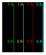
Below the time line is the legend. A colored square is displayed for each trace shown. Next to the colored squares are the test/session/variable names. If the variable is an array, a separate trace is displayed for each element of the first dimension. The second dimension is always interpreted as a time vector. A 4x50 array will get 4 plots of 50 values per simulation frame. A maximum of 20 traces can be displayed in a single chart.

The squares can be used to control the appearance of the plot.
Hides the corresponding trace. An X will be drawn through the square.
Hides the y-axis of the corresponding trace. The plot itself will still be displayed.
Resets the y-axis scale of the corresponding trace to automatically adjust for the minimum and maximum values displayed.
Same as Control Click on Square.

Each trace has its own color coded y-axis. A y-axis may be hidden by shift clicking on the corresponding square in the legend.
The minimum and maximum values of a y-axis may be set to a fixed value by clicking on the value and typing in a new value in the edit box that opens. To reset to auto scaling, control or right click on the corresponding box in the legend.
The format of the labels on the scale of a y-axis may be set by clicking on the axis away from the minimum and maximum values and typing in a new C-style printf format in the edit box that opens.

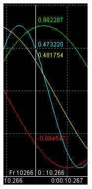
When the mouse moves over a plot, a cursor displays the current time position and color coded values of the traces. At the bottom of the cursor, the frame is displayed on the left and the corresponding timestamp is displayed on the right. Where the cursor intercepts the traces, the value of the trace is displayed.
The slider on the time line (see Time Line) may be used to move rapidly along the time dimension.
You can also click and drag within the chart to adjust the visible range of both axes.
Rolling the mouse wheel forwards will zoom in on both axes and rolling it backwards will zoom out. To zoom on the time dimension only, hold the Control key while rolling the mouse wheel. The time and value(s) represented by position of the mouse while the wheel is being rolled will be the center of the zoom.
Right clicking and dragging will also zoom. Dragging right or left will zoom the time dimension in or out, respectively. Dragging up or down will zoom the value dimension in or out, respectively. The time and value(s) represented by the position of the mouse when it is initially clicked will be the center of the zoom while the mouse is being dragged.
Right clicking on the plot without dragging will reset the zoom level its default level.
Along the bottom of the plot is its time scale. Below that is a dark gray indicator of what portion of the total time line is represented by the plot’s time scale.

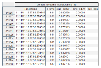
Lays out individual recorded values of RTDB variables in tabular form. When a table is first opened, it displays 2000 simulation frames of data. As with plots, the elements of the first dimension of arrays are treated as separate variables, and elements of the second dimension (if there is one) are treated as values received regularly throughout the frame.
Before a variable is dragged to a table, the top of the table has a Starting Frame field that specifies which frame number the table will begin displaying data from.

The top of a table has a time line representing the entire duration of the test session. It is labeled with the
date and time when the data was recorded. Move the slider to the desired time to
view the values recorded at that time. There is a close button at the far right of the time line
for closing a table, and an save export at the far left for exporting the data to a file.


Exports the table content in CVS format or MATLAB format. Only the selected table cells are exported.
Scroll table to the specified frame number.

Closes a plot.

Above each set of columns is the name of the variable.
Unlabeled column which gives the index of each individual value within the logged data.
Timestamp of when each value was logged.
Simulation frame number.
Value of the variable.
Alternate value of the variable. See Current Value Table and Alternate Values.
Flags of the variable. See Current Value Table and Alternate Values.

|
Viewer Sessions Tab | Memory Considerations |

|