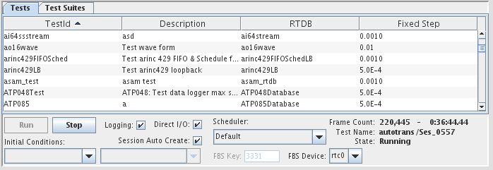

Controls test runs. It displays the list of available test and allows the selection of a test to start and stop. From this panel, scheduling parameters can also be selected for the test run.
The Test Control Panel also displays the status of the running test.
See Geometry.
Allows the user select what column to display in the list of tests.
Show the column with the TestId.
Show the column with the RTDB associated to the test.
Show the column with the fixed step size defined for the test.
Show the column with the script (if any) associated with the test.
Show the column with the test description.
Show the drop down entry field that allows to select a project.
Selected Project

Enter the project that should be selected initially in the widget
Position and size of the test list within the widget. These settings are deprecated and no longer supported.
Horizontal position in pixels measured from the left side of the widget.
Vertical position in pixels measured from the top of the widget.
Width of the test list in pixels.
Height of the test list in pixels.
Color of the text entries in the test list.
Color of the background of the test list.
Color of the static labels in the widget.
Color of the dynamic test status text fields.
The background color for the whole widget. When the color is set to none by clicking on the  button, the background color or image behind the widget will show through the widget.
Image file to use as the background of the widget.
Stretch the background image file to fill the space of the widget. When this option is not selected, the image is clipped to the boundaries of the widget.
Font of the entries in the test list box.

|
Knob | Message Display |

|