Displays the connected variable on a vertical or horizontal linear scale.
It can optionally be configured to support user input to set the value of the associated variable, or a new value can be set by dragging the gauge handle to a new position.
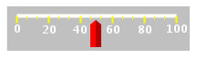
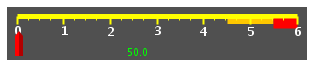
A Linear Gauge with 2 color zones and displaying the variable value:
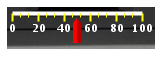
A linear gauge using a background image:
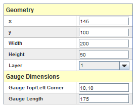
See Geometry.
Position of the top left corner of the gauge within the widget. This is specified as a comma separated pair of values: x,y.
Length of the gauge in pixels.
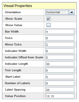
Orientation, either vertical or horizontal, of the gauge.
Show the labels and associated tick marks.
Show the value of the associated variable.
Width in pixels for the gauge’s bar.
Number of major ticks along the gauge.
Number of minor ticks between major ticks.
Width in pixels for the gauge’s indicator.
Distance in pixels from the gauge’s bar to start drawing the indicator.
Length in pixels of the indicator.
Length in pixes of the major ticks. Minor ticks are half this size.
Value of the first scale label.
Number of labels to draw along the scale.
Distance separating successive label values measured in units of the associated variable.
Position of the value specified as a comma separated pair of values: x,y.
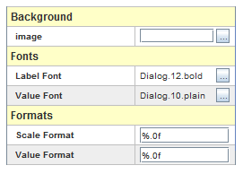
File image to display in the background of the widget.
Font of the labels.
Font of the value when shown.
“printf” style numerical format used to format the gauge’s scale labels. HTML tags are not supported.
“printf” style numerical format used to format the value. HTML tags are not supported.
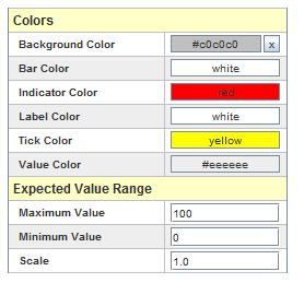
Background color of the widget. Click on the x button to set null background color. When a null background is selected, the background of the HMI display itself is visible behind the active elements of the widget.
The transparency of the widget background. This applies to the background image as well when a background image is specified. This is a number between 0.0 (completely transparent) and 1.0 (completely opaque).
Color of the gauge’s bar.
Color of the gauge’s indicator.
Color of the labels.
Color of the ticks.
Color of the value.
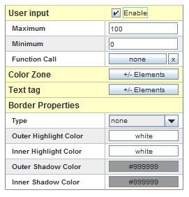
Maximum expected value for the connected variable. This is the highest value displayed by the gauge.
Minimum expected value for the connected variable. This is the lowest value displayed by the gauge.
Numeric scaling factor to multiply the value of the labels when we draw them. I.e for a tachometer, use 0.001 so that the label will show as 1,2,3,... when the value is 1000,2000,3000,....
Allows entering a new value for the associated variable.
To set a new value for the variable, click the mouse inside the widget. An entry field will be created where the value can be entered.
Or, click and drag the mouse to drag the pointer to a new value. Or, right click at the location of the new value.
Maximum value that can be specified for this value. If the value provided is greater than this maximum, an error message dialog is shown and the value is not sent to the real-time host.
Minimum value that can be specified for this value. If the value provided is less than this minimum, an error message dialog is shown and the value is not sent to to the real-time host.
Define position and color for each color zone to display. Color zones are bands of color parallel to the scale used to convey information about values within a particular range.
Edit the entries in the table by clicking on the  button. The following dialog will appear:
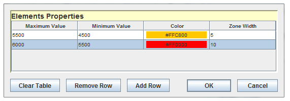
Each zone has the following properties:
Value where this zone ends in units of the connected variable.
Value where this zone begins in units of the connected variable.
Color of the zone.
Width of the zone in pixels.
Place user defined text on the widget display.
Edit the entries in the table by clicking on the button. The following dialog will appear:
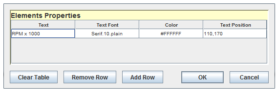
Each text tag has the following properties:
Text to display. HTML tags are not supported.
Font of the text.
Color of the text.
Position of the text specified as a comma separated pair of values: x,y.

|
Gauge | Ribbon Gauge |

|