
Displays a user colored led whose visual properties are selected from a table of states based on the value of the connected variable.
When an LED is clicked on it can set the connected variable to a value based on the current state.

See Geometry.
State table for the LEDs.
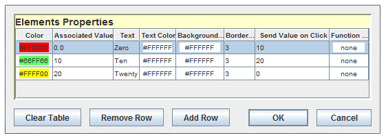
Edit the entries in the table by clicking on the  button. The following dialog will appear:

Each state has the following properties:
Color of the interior of the LED.
Value that selects this state when the associated value is ≤ this value, but > the next lower associated value of the other states.
Text to display in the interior of the LED when this state is selected. Leave this field blank to not display a text. HTML tags may be used to format the text by prefixing the text with “<html>”.
Color of the text inside the LED.
Background color of the border around the LED.
Width in pixels of the border around the LED.
Value to send when the LED is clicked on when in this state. Leave this field blank not to send any value on a mouse click.
Shape of the LED: round or square.
Background color for the widget. When the color is set to none by clicking on the  button, the background color or image will show in the back of the LED widget.
Font of the text inside the LED.

|
Image Table | HTML Browser |

|