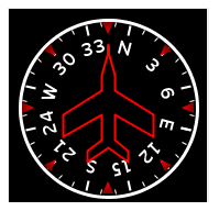
Displays a connected variable representing a plane’s heading as a heading indicator.
The connected variable is the heading measure from North (0 degrees) increasing clockwise where 90 degrees is East. The connected variable can be specified either in degrees or radians.
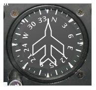
A Heading Indicator that uses a background image:
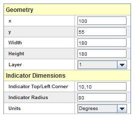
See Geometry.
Position of the top left corner of the circular indicator gauge within the widget. This is specified as a comma separated pair of values: x,y.
Radius in pixels of the circular indicator gauge.
Units (Degrees or Radians) of the connected variable.
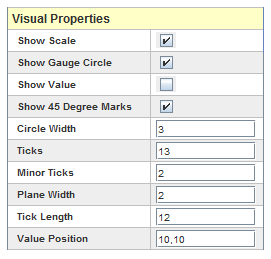
Show the labels and associated tick marks.
Show the circular arc that defines the gauge.
Show the heading value for the associated variable.
Show the red marks at 45 degrees angle separation along the outer rim.
Outer circle width in pixels.
Number of major ticks to display along the circle.
Number of minor ticks to display between the major ticks.
Width in pixels of the plane that indicates the heading.
Pixel length for the major ticks. Minor ticks half this size.
Position the value within the widget, specified as a comma separated pair of values: x,y.
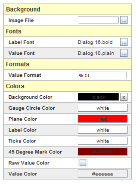
File image to display in the background of the widget.
Font for the labels.
Font for the value when shown.
“printf” style numerical format used to format the value. HTML tags are not supported.
Background color of the widget.
Color of the gauge arc.
Color of the plane.
Color of the labels.
Color of the ticks.
Color of the value.
Color of the indicators drawn at 45 degree intervals.
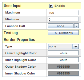
Allow the user to enter a new value for the associated variable. To set a new value for the variable, simply click the mouse inside the widget and an entry field will be created where the value can be entered.
Maximum value that can be specified for this value. If the value provided is greater than this maximum, an error message dialog is shown and the value is not sent to the real-time host.
Minimum value that can be specified for this value. If the value provided is less than this minimum, an error message dialog is shown and the value is not sent to to the real-time host.
Place user defined text on the widget display.
Edit the entries in the table by clicking on the  button. The following dialog will appear:
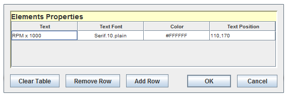
Each text tag has the following properties:
Text to display. HTML tags are not supported.
Font for the text.
Color of the text.
Position of the text specified as a comma separated pair of values: x,y.

|
Altimeter | Attitude Indicator |

|