Action Button
Performs an action when clicked on. It can set a connected variable to a value, open a particular display, open a display selected by a file selection dialog, start a test, etc.
Geometry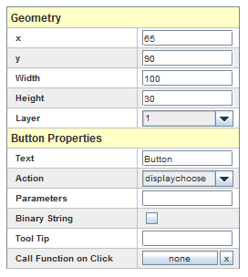
See Geometry.
Button Properties
Text
Text to display inside the button. HTML tags may be used to format the text by prefixing the text with “<html>”.
Action
Action associated with clicking on the button. It can be one of:
displaychoose
Open the file selection dialog to pick a display to open.
displayopen
Open the display whose name is given by the Parameters property.
displayclose
Close the display that contains this button.
quit
Quit the application.
sendvalue
Set the value of the connected variable to the value given in the Parameters property.
sendpressrelease
Set the value of the connected variable to the first value in the Parameters property when the button is pressed, and set the value to the second value of the Parameters property when the button is released. Parameters must be entered as a pair of values separated by ‘/’.
starttest
Start running a test. The Parameters property specifies the test to start :
They are 2 ways of specifying the parameters associated with the test to be run:
Legacy Mode: The Parameters property specifies the test to start as a comma separated list of tokens where the tokens have the following meaning:
test name, initial condition name, scheduler type [,fbs key
[,device]] [,session name[,nodatalogging]]
Key=Value Mode: The Parameters property specifies a comma separated list of key=value tokens where the following keys are supported:
- test= : The name of the test to run.
- project= : The project to select before starting the test. If this is not given, the system will try to start the test under the currently selected
project. when this property is given, the project will be selected just before the test start and the old project will be reselected after starting the test run.
- session= : The session name to run. The session must exist under the test. If this is not specified, the system will auto create the session and additional
parameters specific to the session that is created can be specified.
- schedtype= : The scheduler type when the session is auto created. Valid value for this keywords are:
- default : Use the default SimWB FBS to run.
- timer : Use an OS timer to dispatch the scheduler at the fixed step rate defined for the test.
- spinning or redline : Use the SimWB red line scheduler.
- simulation : Run the test in simulation mode.
- sofrt : Run with default SimWB FBS but allow overruns of max 1 scheduler frame.
- existing or noconfigure : Use a precreated FBS configuration.
- fbskey= : This is the FBS id to use. This FBS entry must have been created outside of SimWB and a user program is responsible for dispatching the FBS interrupts.
- user or userfbsdef : Create a FBS with the specified key and FBS device as follows.
- fbskey= : This is the FBS id to create the new FBS scheduler.
- fbsdevice= : The RCIM device that triggers the FBS. I.e. rtc0,rtc1,... See below for more devices.
- schedstats= Y or y or 1 : Will enable scheduling statistics when the session is auto created.
- datalogging= Y or y or 1 : Will enable data logging when the session is auto created.
- directio= Y or y or 1 : Will enable direct I/O when data logging is enabled.
- asyncio= integer : The amount of μseconds for the async I/O processing. This only applies when the session is auto created. The default value is 20 μsecs.
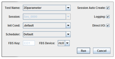
When some of the fields are missing, a dialog is displayed to allow the user to completely define the conditions to run the test as shown here:
|
Parameter Field
|
Description
|
|
Test Name
|
Name of a test that exists on the real-time host. When this parameter is not given, the user can pick the test from a drop down list of available tests.
|
|
Session Auto Create
|
Automatically create a new session on the real-time host when starting a new test run. The combo box of existing sessions is disabled.
|
|
Session
|
Select the session to run from the list of available sessions for the selected test. When reusing a previous session, the user cannot set any of the scheduler options nor select the initial conditions set.
|
|
Initial Condition
|
Name of the initial condition set to use to run this test. When not given the default initial condition “.default” is used.
|
|
Scheduler Type
|
The scheduler to use to run the test. For more details on the schedulers, see Scheduler. The scheduler can be one of:
default: Default FBS scheduler defined for SIMulation Workbench.
timer or softtimer: Soft Timer. This doesn’t use the FBS.
softrt: Soft Real-Time. This is more tolerant on overruns.
spinning or redline: Red Line Scheduler. This uses semaphores instead of the FBS, requiring each task to be on a CPU.
user or userfbsdef: FBS whose key and device is specified in tokens four and five, respectively, of the Parameters property.
existing or noconfigure: Pre-existing FBS. Don’t Configure FBS; attach to a pre-existing FBS key. In this case the FBS must be started by an external application. The FBS key is given as token four of the Parameters property.
|
|
FBS Key
|
FBS key to use when the scheduler is either user or existing
|
|
FBS Device
|
FBS device to use when the scheduler supports FBS. It can be given as one of rtc0, rtc1, rtc2, or rtc3 to use internal real-time clock on the RCIM board or eti0, eti1, eti2, or eti4 to dispatch FBS via an externally connected interrupt.
|
|
Session Name
|
Session name to run. This can only be specified if all other fields are entered.
For example: rtdemo1,.default,default,main would run the main session of the rtdemo1 test using the default initial conditions and scheduler.
|
|
starttestsuite:
Start running a test suite. The parameter property specifies the name of the test suite to start as a comma separated list of tokens where the tokens have the following meaning:
test suite name, scheduler type [,fbs key [,device]]
When some of the fields are missing, the same dialog as above dialog is presented to the user on button click to allow the user to completely define the conditions to run the tests.
|
Parameter field
|
Description
|
|
Test Name
|
Name of a test suite that exists on the real-time host. When this parameter is not given, the user can pick the test from a drop down list of available test suites.
|
|
Scheduler Type
|
The scheduler to use to run the test. For more details on the schedulers, see Scheduler. The scheduler can be one of:
default: Default FBS scheduler defined for SIMulation Workbench.
timer or softtimer: Soft Timer. This doesn’t use the FBS.
softrt: Soft Real-Time. This is more tolerant on overruns.
spinning or redline: Red Line Scheduler. This uses semaphores instead of the FBS, requiring each task to be on a CPU.
user or userfbsdef: FBS whose key and device is specified in tokens three and four, respectively, of the Parameters property.
existing or noconfigure: Pre-existing FBS. Don’t Configure FBS; attach to a pre-existing FBS key. In this case the FBS must be started by an external application. The FBS key is given as token three of the Parameters property.
|
|
FBS Key
|
FBS key to use when the scheduler is either user or existing
|
|
FBS Device
|
FBS device to use when the scheduler is existing. It can be given as one of rtc0, rtc1, rtc2, or rtc3 to use internal real-time clock on the RCIM board or eti0, eti1, eti2, or eti4 to dispatch FBS via an externally connected interrupt.
|
|
stoptest
Stop the running test.
sessionstatus
Start a web browser on the SimWB session status page.
Parameters
Parameters specific to the selected Action property value.
Binary String
Specifies that Parameters for setting the value of a string variable should be interpreted as a binary string format. See String Variables.
Tool Tip
Text to display as a tool tip when the mouse hovers over the button. HTML tags may be used to format the text by prefixing the text with “<html>”.
Icon Images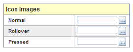
Normal
Name of an icon image file to display in the button.
Rollover
Name of an icon image file to display in the button when the mouse hovers over the button. When not given, the button does not display any special effect when the mouse moves over it.
Pressed
Name of an icon image file to display in the button when it is pressed. If not given, the button will display the normal icon when pressed.
Fonts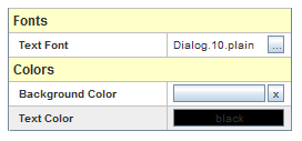
Text Font
Font of the button’s text.
Colors
Background Color
Background color of the button. When the color is set to none by clicking on the  button, the default button background will show in the back of the button.
Text Color
Color of the button’s text.


 button, the default button background will show in the back of the button.