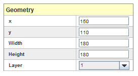
All widget have a common set of properties that appears first in the list of properties. They are the general geometry properties that set the widget position and size in the display window. Position is measured from the top left corner of the display window where x and y are the horizontal and vertical offset respectively. Offsets and sizes are measured in pixels. The layer property defines the Z order of the widget within the display so that a widget can be placed on top of another widget and be visible. By default , all widgets are created in layer 8 , which is the top-most layer.
Horizontal position in pixels from the display window’s left margin.
Vertical position in pixels from the display window’s top margin.
Width of the widget in pixels.
Height of the widget in pixels.
Layer to place the widget in. Default is 8, which is the top-most layer.
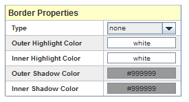
Most widgets have Border Properties. These properties control the drawing of a rectangle around the perimeter of the widget.
Selects the type of bevel to draw.
Disables drawing a border.
Selects a border that makes the interior appear lowered relative to the exterior.
Selects a border that appears to be a line etched into the plane of the interior and exterior.
Selects a border that makes the interior appear to be raised relative to the exterior.
Selects a border that appears to be a line in relief relative to the plane of the interior and exterior.
Color of the outer edges of the lit sides of the border.
Color of the inner edges of the lit sides of the border.
Color of the outer edges of the sides of the border in shadow.
Color of the inner edges of the sides of the border in shadow.
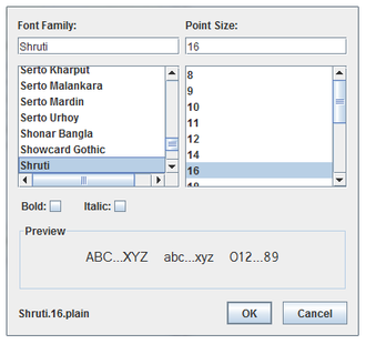
Selects the font family from the list or by the first few letters of the family name being typed into the text box.
Selects the point size from the list or by the size being typed into the text box.
Selects a heavy (bold) version of the font.
Selects a slanted (italic) version of the font.
Shows some sample text rendered in the selected font.
Shows the name of the selected font in the lower left corner.

Exits the dialog passing the selected font back to HMI Builder.

Exits the dialog without passing a new font back to HMI Builder.
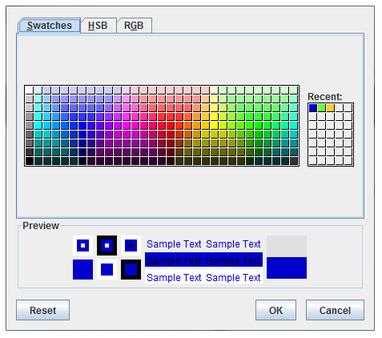
Displays a section of common colors to choose from.
Displays previews of the selected color in a variety of contexts.

Resets the selected color to be the same as the original color.
Exits the dialog passing the selected color back to HMI Builder.
Exits the dialog without passing a new color back to HMI Builder.
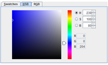
Selects a color using the hue, saturation, brightness color space. Select one of H, S, or B to be the dimension adjusted by the vertical slider bar, and the other two dimensions can be adjusted by clicking within the square.
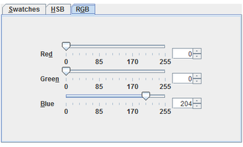
Selects a color using the Red, Green, Blue color space. Select each component using its slider or typing in its field or using the buttons next to its field to increment or decrement the value.
You can specify an identifier string for each widget that you add to the HMI. You can use the identifier string, for example, to validate the display file using an XML parsing utility.


|
Widget List | Action Button |

|